
John Snow’s Interactive Cholera Map

In 1854 in the Soho district of London there was a severe cholera outbreak, famously known as The 1854 Broad Street cholera outbreak, taking the lives of 616 people. While the bacterium was isolated the same year by Italian anatomist Filippo Pacini, it was still unknown how the disease spread, crediting the transmission to bad air, known as “miasma”. John Snow, an English physician and advocate of medical hygiene, being very skeptic, began investigating for the cause of the infection. After visiting the area and talking to local residents, he identified the source of the outbreak to the local water pump that people used to drink water. To prove his point and persuade the local council to disable the well pump, he created the famous “Cholera Map”, which as a result immediately ended the outbreak.
In this project I am using John Snow’s data and to create an interactive version of the Cholera Map.
John Snow’s Interactive Cholera Map Visualization
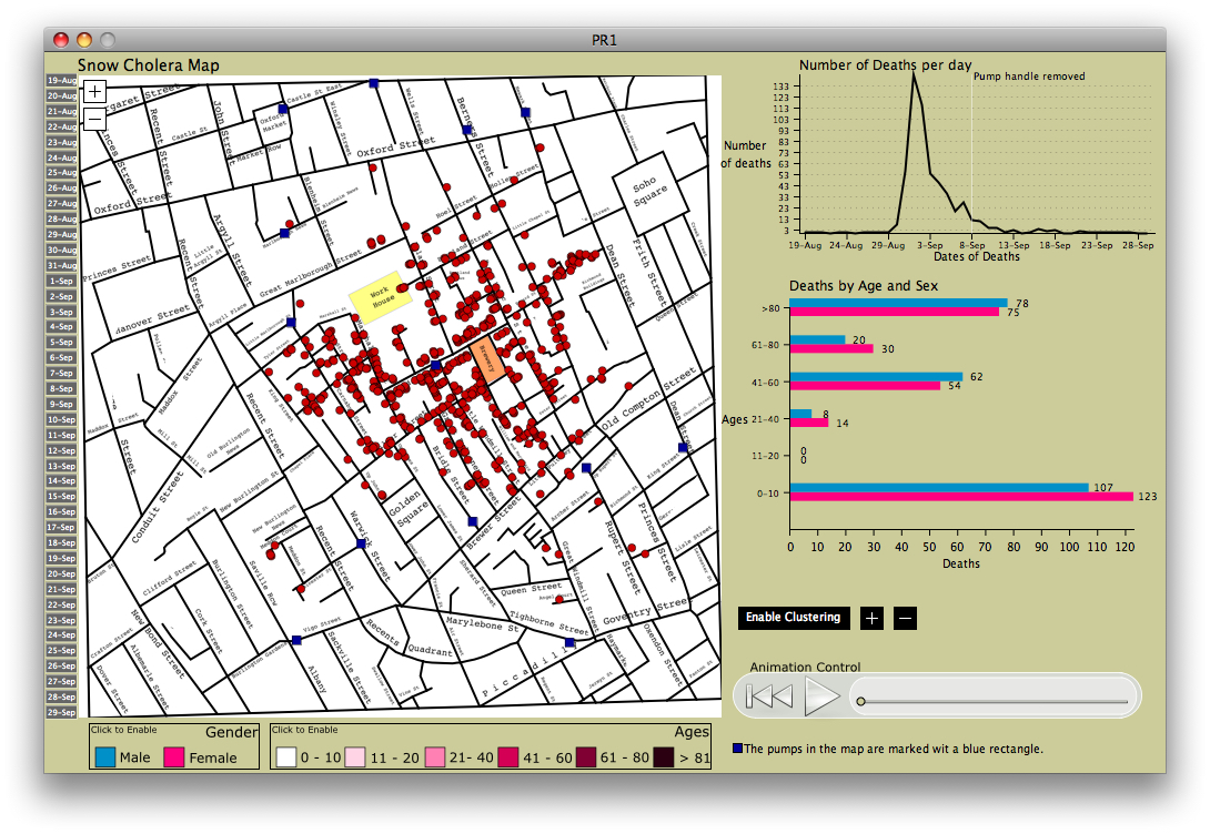
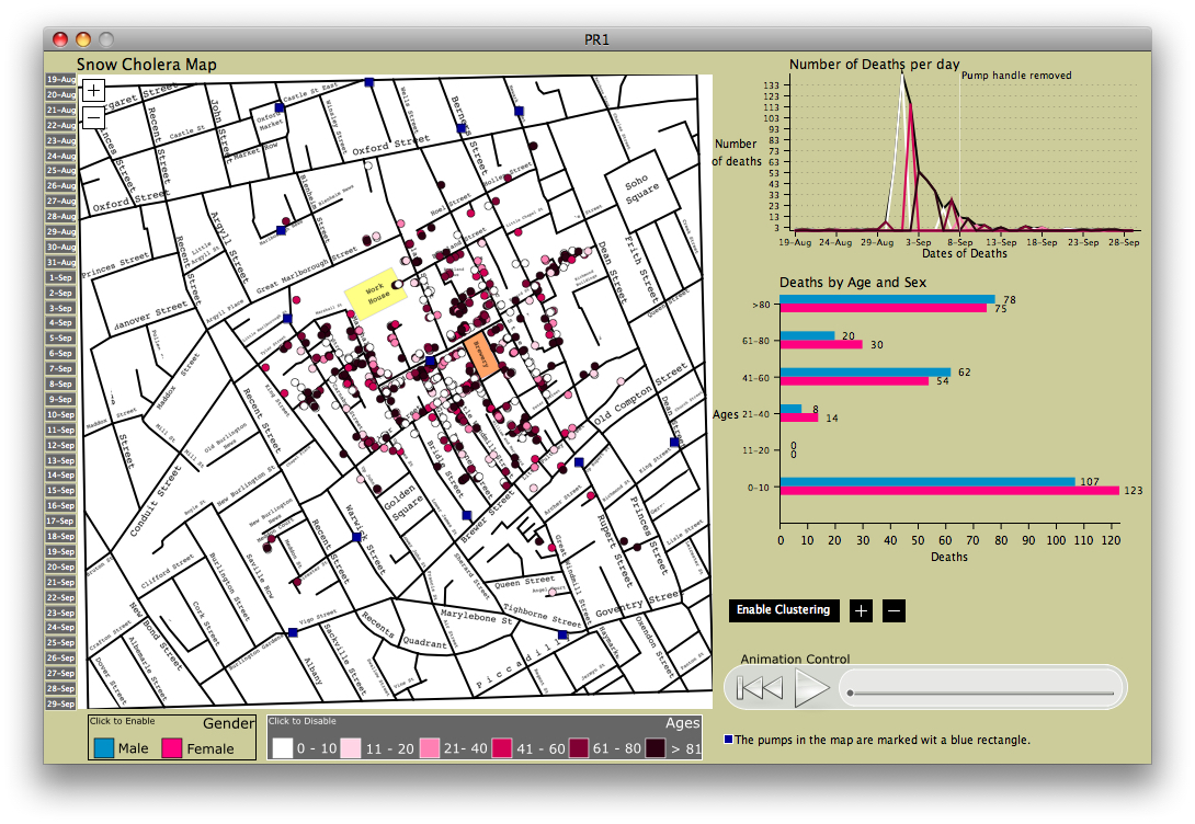
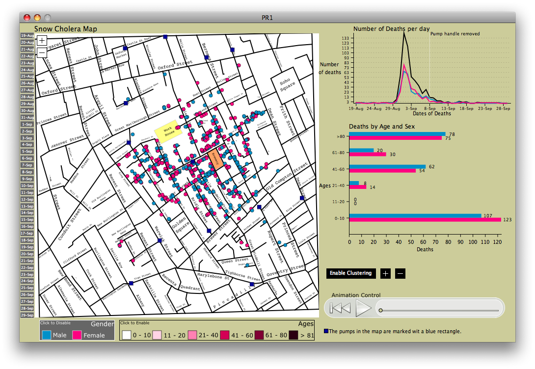
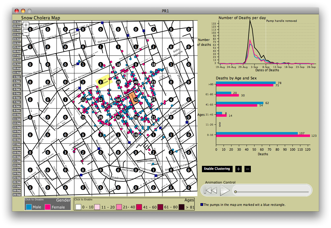
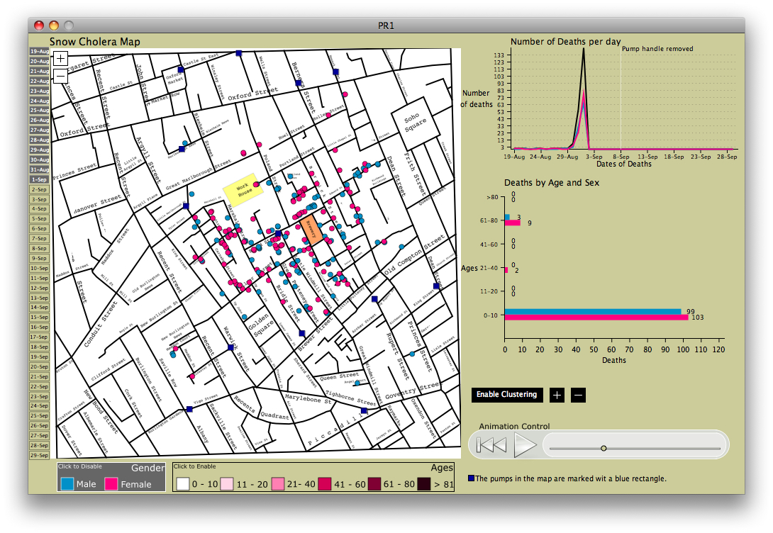
The visualization allows the exploration of John Snow’s data in an interactive way. The tool consists of an interactive map with support for zooming and panning, a time region selection widget (left of the map) and graphs displaying the number of deaths per day, and deaths by age and sex for the selected time period. There is also a clustering mode, that partitions the map into variable width boxes, enabling exploration of areas of interest. Finally, with the playback control (bottom right), the user can scroll through the selected dates or play the selection as an animation.
Download
Application has been developed in Processing. For the binaries, Java 7 is required.
Source Code | Win32 | Win64 | Linux32 | Linux64 | Mac OSX
Gallery
Acknowledgements
Application was developed for the Fall 2009 Visualization and Visual Analytics course (CS424), taught by my advisor Prof. Andrew Johnson, at the University of Illinois at Chicago.